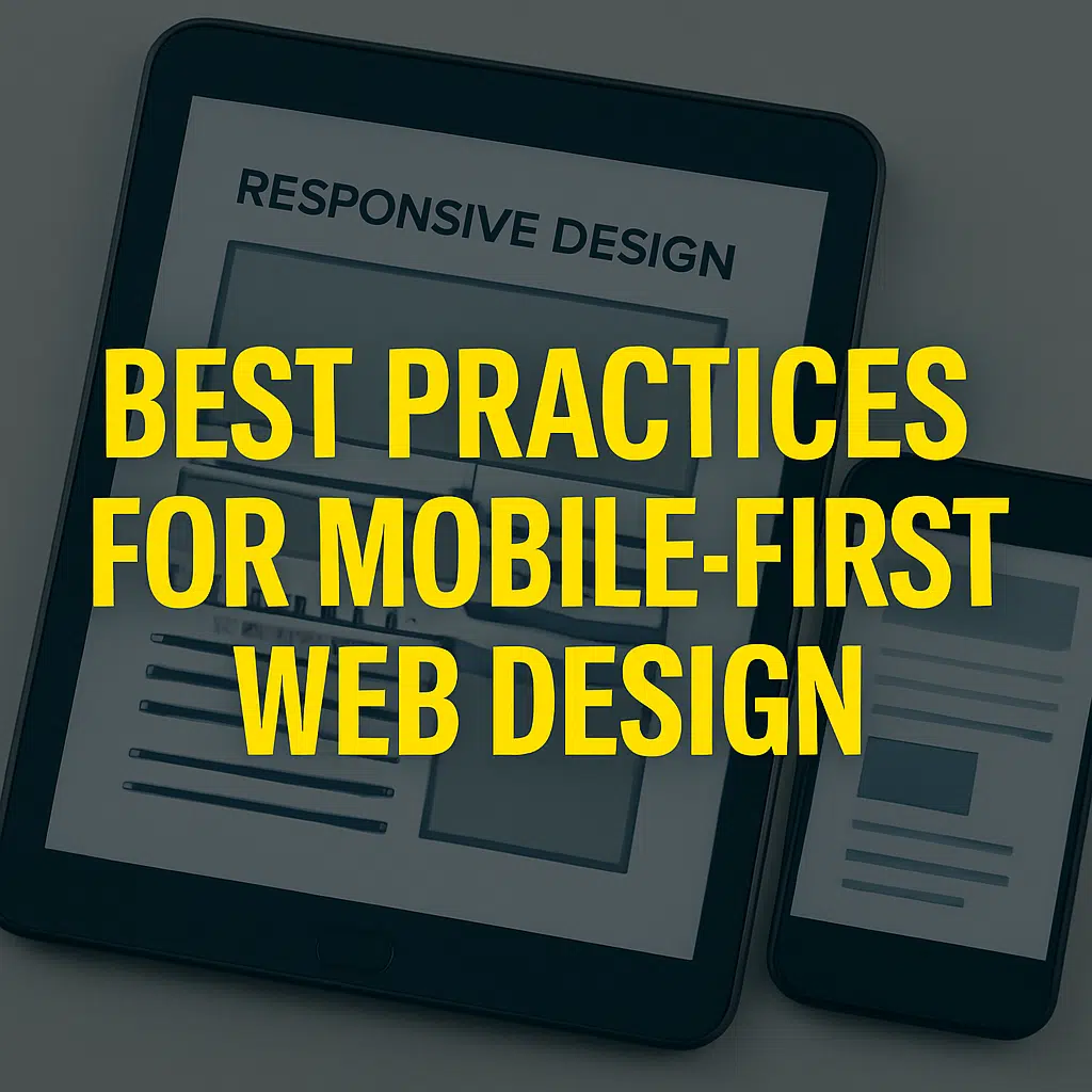
Best Practices for Mobile-First Web Design
With over half of global web traffic coming from mobile devices, best practices for mobile-first web design are no longer optional—they are essential. A mobile-first approach ensures your website is designed for smaller screens first and then scaled up for larger devices. This method prioritizes usability, speed, and clarity, all of which are crucial for user experience and search engine rankings.
In this post, we’ll explore the best strategies to help your website thrive in a mobile-driven world.
Design with the Smallest Screen in Mind
The Best Practices for Mobile-First Web Design includes mobile-first philosophy means designing for smartphones before desktops. Start with the essentials—clear navigation, concise content, and responsive layouts. By prioritizing smaller screens, you ensure that your website remains functional and attractive across all device sizes.
Our Web Design Services focus on building layouts that adapt seamlessly, ensuring users enjoy a smooth experience whether they’re browsing on a phone, tablet, or desktop.
Prioritize Website Speed and Performance
One of the most critical best practices for mobile-first web design is optimizing speed. Mobile users expect pages to load instantly, and delays can lead to higher bounce rates. Compressing images, minimizing code, and using caching tools are proven ways to improve load times.
Pairing this with reliable Web Hosting Services ensures your website is supported by the infrastructure needed to handle traffic efficiently.
Optimize for Touch-Friendly Navigation
Unlike desktop users, mobile visitors navigate with their fingers. Buttons, links, and menus must be large enough to tap easily without zooming in. Dropdown menus should be simplified, and spacing between interactive elements must be generous to avoid accidental clicks.
This kind of usability improvement is integrated into our Custom Code Website Design projects, where we tailor navigation systems to user behaviors on mobile.
Focus on Content Hierarchy
Screen space on mobile devices is limited, making content hierarchy vital. Place the most important information at the top, use concise headlines, and break up text with visuals. A well-structured hierarchy ensures that visitors can quickly understand what your site offers without scrolling endlessly.
We emphasize this in WordPress Website Design, ensuring your content flows naturally while staying visually engaging.
Use Responsive Images and Media
Images and videos should adjust fluidly to screen sizes without compromising quality. Responsive media ensures a consistent user experience regardless of the device. Additionally, images should be compressed to prevent slow load times without losing clarity.
Our Graphic Design Services ensure that all visual elements align with your branding while remaining performance-friendly for mobile browsing.
Incorporate Mobile SEO Best Practices
Best practices for mobile-first web design extend beyond visuals—they include SEO considerations. Since Google uses mobile-first indexing, ensuring your site is mobile-friendly directly impacts your search rankings. Structured data, fast-loading pages, and mobile usability tests are crucial to maintaining visibility.
Our SEO Services align with Best Practices for Mobile-First Web Design requirements, helping your business rank higher while delivering a better experience for users.
Leverage Mobile Analytics for Continuous Improvement
Optimizing for mobile isn’t a one-time process. Using analytics tools helps identify where users drop off, which pages perform best, and how navigation can be improved. Regular audits allow you to adjust and refine your design for better results.
For further insights, Google’s Mobile-Friendly Test is a valuable free tool to evaluate your website’s mobile readiness and highlight areas for improvement.
Conclusion
Following best practices for mobile-first web design ensures your website meets the expectations of today’s mobile users. By focusing on speed, navigation, content hierarchy, and responsive design, you create an experience that keeps visitors engaged and encourages conversions.
At Canadian Development Technology, we specialize in building mobile-first websites that combine performance, design, and branding. Whether through Web Design, SEO, or Digital Marketing, our team ensures your site is future-ready and built for success.